|
Website Layout
The website is wonderful and the information is extremely interesting and useful!
I do however believe that because the website looks fairly disorganized that it does not encourage people to pay membership dues.
My concern though is with the layout. How it stands currently, it makers navigation difficult. I would suggest having a drop down menu at the top of the page. The menu bars should contain (in general) the information that is sitting on the left side of the page currently.
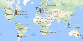
Another consideration that I would offer is that another way of segregating posts is by region. What would be useful and "fun" would be to have a simple world map that each region or continent highlights when scrolled over. When accessing the highlighted region it would sort to information relevant to the area.
I have several other ideas, just let me know if you are interested.
Thanks
|


 Threaded Mode


